
Core Gameplay Loop
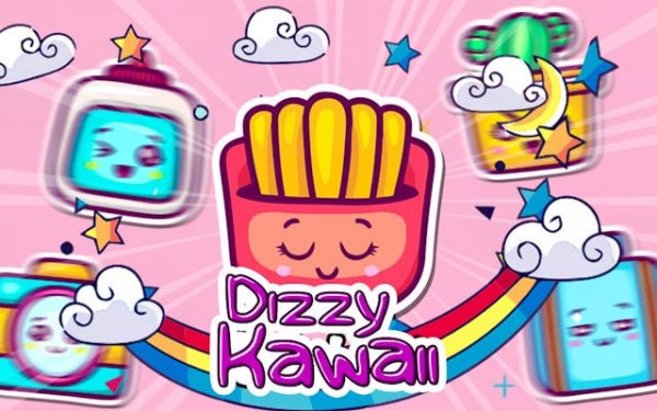
Players see a grid of colorful icons, each with a unique design. The goal is to find and tap pairs that match. Each round begins with a brief memorization phase, then the icons are hidden. Players rely on their recall to select the correct pairs. Successfully matching all icons before the timer ends advances the round. The pace increases gradually, encouraging quicker recognition and sharper focus.
Visual Style and Appeal
The icons are designed with soft, rounded shapes and cheerful colors. This visual approach makes the game inviting for younger players while remaining pleasant for adults. The backgrounds are clean and uncluttered, reducing distractions. Animations are subtle, providing feedback without overwhelming the screen. The overall look supports the game's goal of creating a calm yet engaging environment.
Progression and Difficulty
Early rounds present a small grid with few icons, allowing players to build confidence. As players succeed, the grid expands and the number of icons increases. The timer also shortens, adding a layer of urgency. This gradual ramp-up keeps the experience fresh without causing frustration. Players can track their best times and aim to improve with each attempt.
Family-Friendly Design
No reading is required to play, making it accessible to pre-literate children and non-native speakers. The controls are simple taps, responsive on both touchscreens and mouse inputs. There are no ads that interrupt gameplay, and no in-app purchases. This design choice ensures that the focus remains on the puzzle itself, not on monetization mechanics.



Comments
0 comments